Monday, 28 September 2015

Cooper Gallery

Upon my arival at the Cooper gallery i found all of the work to be photos, all of the photographs were in black and white and this looked very admirable as they were all the same and uniformed, therefore you could tell it was all one persons work, if I were to try to copy one of these i would use pencil on white paper or maybe black paper and white and grey pencils... I also would like to try the black and white photos in the photography workshop as i found the work in the Cooper gallery very appealing!

Artist research

For my artist i chose to look at a tattoo artist named Robert A Borbas, he is a freelance iillustrator/ designer/ animation designer located in the middle of Europe, Hungary, Budapest. Better known as GRINDESIGN he has worled for tons of bands all over the world from Europe, through the US and Australia.
His media choices include pens, pencils and adobe Photoshop or illustrator. 70% of his work is hand drawn and then colour is added by using a computer.
I decided to use pencils as i think it best shows his work, this also made my work a critical study as the media chosen is the media in which the artist uses.

Thursday, 11 June 2015

Glossary


AVANT GARD:

Applied to art, avant-garde means art that is innovatory, introducing or exploring new forms or subject matter

CARL ANDRE BRICKS

Kinetic art:

is art that depends on motion for its effects

e.g. Alexander Calder- Antennae with Red and Blue Dots 1960

Installation art:

is used to describe mixed-media constructions or assemblages usually designed for a specific place and for a temporary period of time

e.g. Cornelia Parker Cold Dark Matter: An Exploded View 1991 &   Rachel Whiteread

Figurative art 

Describes any form of modern art that retains strong references to the real world and particularly to the human figure e.g. Picasso 

Abstract art

 is art that does not attempt to represent an accurate depiction of a visual reality but instead use shapes, colours, forms and gestural marks to achieve its effect; it could be based on a subject such as a figure, landscape or object or may have no source at all in the external world e.g. : Kandinsky

Other Key Words 

Liner

Stop motion : Onion skinning 

Meditate and synthesis an image 

silhouette

Zoetrope: Reciprocal Action & Persistence of vision 

Objets trouvés

Theater d'ombre

What is time based media?

Typical examples of this category are video and sound artworks, film or slide-based installations, software-based art and other forms of technology-based artworks, many of which can also be regarded as installation art. The Guggenheim collection contains several hundred time-based media artworks, including works by Marina AbramovicMatthew BarneyBruce NaumanNam June PaikJason Rhoades, and many other important contemporary artists.

Civic propaganda exhibition

Jonathon Borofsky

Jonathon Borofsky was born in Boston, Massachusetts.
He received his Bachelor of Fine arts at Carnegie Mellon University in 1964he then later continued his studies at France’s Ecole de Fontainebleau and received his Master of Fine Arts from Yale University in 1966. He lived in Manhattan until a teaching position at the California Institute of the Arts brought him to Los Angeles in 1977. He resided in Venice and Tuna Canyon, Los Angeles from 1977 to 1992, in the 1960’s, Borofsky’s art sought to interconnect minimalism and pop art.
On May 21st, 2006, Borofsky received an honorary doctorate in Fine Arts from Carnegie Mellon, his alma mater. Jonathan Borofsky's most famous works, at least among the general public, are his Hammering Man sculptures. "Hammering Men" have been installed in various cities around the world. The largest Hammering Man is in Seoul, Korea and the second largest is in Frankfurt, Germany. Other Hammering Men are in Basel, Switzerland, Dallas, Denver, Los Angeles, Minneapolis, New York, Seattle, Washington, D.C. and Lillestrom, Norway.

Commissioned by developer Harlan Lee, Borofsky’s 30-foot-tall sculpture Ballerina Clown was erected above the entrance to a drug store in a mixed use, residential and commercial building in Venice, California in 1989.

Christian Boltanski

Christian Boltanski was born in paris, France in 1944, he was a French sculptor, photographer, painter and film maker. 
Boltanski in 1986, began creating mixed media/ material instillations using light as a key factor of his work. Using tin boxes, altar-like construction of framed and manipulated photographs of Jewish school children taken in Vienna in 1931 which was then used as a grim reminder of the mass murder of Jews by the Nazis. Boltanski’s work featured in an exhibition at Basel, Museum Gegenwartskunst, 1989. His enormous instillation titled ‘No man’s land’ (2010) at the Park Avenue Armory in New York, is a great example of how his constructions and installations trace the lives of the lost and forgotten. 


Boltanski has participated in over 150 art exhibitions throughout the world. He has also had solo exhibitions at the New Museum (1988), the Kunstmuseum Liechtenstein, Magasin 3 in Stockholm, the La Maison Rouge gallery, Institut Mathildenhohe, the Kewenig Galerie, The muse d’art et d’histoire du judaisme and many more.
In 2002, Boltanski made the installation "Totentanz II", a Shadow Installation with copper figures, for the underground Centre for International Light Art in Unna, Germany.


His awards as shown below;
  • 20.07 billionéateurs sans frontières award for visual arts by Cultures France[6]
  • 2007  Praemium Imperiale Award by the Japan Art Association[6]
  • 2001 Goslarer Kaiserring, Goslar, Germany[6]
  • 2001 Kunstpreis, given by Nord/LB, Braunschweig, Germany


Wednesday, 10 June 2015

Final piece


My final piece i decided to do a canvas between A1 and A0 of a Native American trapped behind the bars of the American stripes, i painted the stripes in red however i let the paint dry with wierd strokes in it so that it made it look like blood, like all the blood the white people spilled. I also did the native american in black and white however the stars and stripes are all in colour to make the point that white people took everything from the natives even their colour. However the native chief i have depicted is looking into the distance proudly as though they can take everything but never his pride! I used acrylic paint to do the canvas (which I prepared myself using a wooden frame and material from the textiles workshop) i used acrylic as i felt the most comfortable using this to finish a big piece. If i were to do this again i would maybe dedicate more hours just to touching up the piece making sure lines are 100% straight and edges cleaned. 

Native American A3

For my A3 sheets on Native Americans i began with doing just different pen sketches of different native americans portraits, i also tried to develop my ideas further by drawing a child playing, i did this because i was looking into craig davison. I also drew native american symbols such as the symbols for peace, war and freedom. If i were to do this sheet again i would use more medias to make the sheet more interesting seen as i only used pen and watercolour. 
My second sheet was a colourful sheet which i used brusho inks for however my drawings i either used pen or acrylic paint i believe that using the black and greys on this sheet was effective as the background is very colourful. This sheet i began to develop my ideas again by putting an american flag onto the sheet, i did this to show i had looked into the flag for my final design. I also did a few more sketches of portraits as well as a silhouette. If i were to do this again i may not have used such darker colours for a background so that i can then use more colour in the drawings.

Tuesday, 9 June 2015

Mental health development

For my mental health sheet i decided to stick to dark tones such as greys and black, i did this to show a depressing aspect to my sheet, i did things on the sheet such as a brain with a lock and chains around, a person walking into a lock and a treewith a skull in it to resemble death, one side has a girl on a swing, a symbol for me of happiness however on the other side there is someone hanging by the neck... Half of the tree is birds flying away and i thought this could resemble someones mind flying away as though they are losing themself. For this sheet i used brusho inks and acrylic paints i only used these as i believed they could keep the sheet as dark as possible. If i was to do this again i would keep all the sheet to the same consistancy and not have half the sheet looking good and the other half looking rushed. 

Monday, 8 June 2015

Native Americans (63)

My native American pieces are all done in pen as most of them are just symbols that all mean different things, freedom, war, peace and friendship! These were all done in a rush and could have had more time spent on then to make them look alot better. 

Human rights (63)

For my human rights peices i decided to do 2 about transgender people one for a man in a womans body and one for a woman in a mans... I also did one on gender equality and one on gay pride, the last one i did on just generic human rights. I used pen and pencil colours for these and 3 of the four i hate and wish i could do again, if i were to do them again i would take more time and care in the pieces i have done.

Political (63)

My political pieces i decided to do a variety of things such as 'ideas vs guns' political parties/leaders and even one from V for vendetta a film about politics. I used mainly black pen for this as most of the drawigs i did were silhouettes or symple drawings... If i were to do these again i may use different medias to make the images look more realistic or lifelike instead of cartooned or blocked. 

Holocaust (63)

For these 4 sheets i did about the holocaust and mainly showed wire, chains and fences, this was all to show the entrapment of humans, i used pen for these as they were all simple drawings or black and white drawings and i thought these looked effective. If i were to do this again i would not have rushed and would have took more time and care into my artwork.

Symbols of freedom (63)

For my symbols of freedom sheets, i chose to do a variety of things from birds to films, films to words. Most of my sheets have the word freedom in it or birds as they are the obvious choices however there are a certain few which are just symbols from different countries e.g.
For these pieces, again i stuck to my comfort zone of pen and pencil i almost always stick to these medias because they are the ones that make my work look the most effective! If i were to do this again i wouldnt rush some of the pieces i have done to make them look better.
The captain america was done to show that when it was first made, it was a symbol that people could be free of hitler therefor it is a symbol of freedom for me.

Religion (63)

In this lot of my 63 i chose to look into religion, my first aim was to look into how some people find an 'escape' in religion however i couldn't decide how to how to best portray this so instead i looked at some of the many religions, to draw the symbols on my sheets I decided to use pens as i thought just a solid symbol on coloured backgrounds would be the best way to show and attract the viewer... The only sheet i did differently was the one of buddah, i did this one in pencil and shaded the face of buddah, i used pencil because that is what i am most comfortable doing portraits in. If i were to do this again i might have used different medias and pushed myself out of my comfort zone. 

Mental health (63)

To begin with i looked into mental health and the side of freedom in which people find they are trapped inside their own mind being held back. For these few sheets i decided to use medias such as pencil and pen to keep the sheets dark and 'depressing' looking. I also learned how to make a noose and tied one to a sheet to add a 3D aspect to make my sheets look better, i also used only pen amd pencil as they are the medias i feel most comfortable using. If i were to do these sheets again i would probably try to use more medias just to make my sheets look a little more interesting.

Thursday, 21 May 2015

Magna carta

The magna carta was the first written document which consisted of rules that everyone had to obide to even the king. The document is one page consisting of 63 chapters, each chapter explains a rule but no chapte contains a rule that is the same as another. 

Thursday, 7 May 2015

Matisse...

We travelled to the matisse exhibition in barnsley so we were able to see his work and take a few pictures of his images and gather information about the artist himself. We also had time to take pictures of buildings around the area. When we was satisfied with the amount of images and information we had gathered we headed back to college to create a cardboard box inspired by Matisse and Samantha Groom. 

Forts!!

To begin another session we made forts out of cardboard boxes to get us used to building with the boxes provided. We then were told to demolish them slowly to use the boxes to create a pyramid which we had to communicate as a team to construct to its strongest and largest without falling! This was an easy enough task in the end! 
After we completed the pyramid we then demolished it to create a theatre (or theatre d'ombre) so we could watch a shadow show using the wire figures we had constructed in an earlier lesson during our first week. The figures were moved or shaken and we documented this using either slow motion or time lapse or even using a series of images we took from cameras.

FMP development of ideas

I began to look at native american culture in my 63 mini pieces so i decided to develop my ideas further. I did this by looking at an artist named craig davison, this artist shows children playing as a famous film character then behind them depicts the characters in which they are playing in a ghost like representation. I decided i could do a child playing dress up as a native American then in the background do an actual Native American chief with the headdress. I began to look at chiefs and their heddresses and also drew a child playing as a native american.


1st lesson of cardboard city

Our first lesson consisted of us all heading to the 5th floor, we were given pens to draw on the window and we had to draw what we saw outside the window, while doing this another person had to take photos of the progression so we could then create a time-lapse. When we had enough pictures we were allowed to add our own personal bits e.g dinosaurs, robots, dragons and aliens... We had to also document this in pictures to again see the progression. 
When we had completed the window drawing we came back up to make silhouettes of our bodies by laying down on large sheets of paper and drawing around eachother. When there were enough images on the paper we were told to select 2 images... One from either side of the room to draw on an A4 sheet, we then recreated the silhouettes in wire and then made brains, lungs and hearts for them.
We then were told to walk around the room in a group in a variety of different ways whilst someome videod this so we were able to make a time-lapse. We did a variety of different walks and some people only videod the legs or the top half of our bodies.


Tuesday, 28 April 2015

History of zoetrope

A zoetrope is one of several pre‑film animation devices that produce the illusion of motion by displaying a sequence of drawings or photographs showing progressive phases of that motion.. We had to make one of these by drawing 12 images 6 of these must be a continuous image moving then the other 6 have to be identical this is to give the illusion of continuous movement. The zoetrope is one of several animation toys which were invented in the
19th century, as people experimented with ways to make moving pictures.  
The zoetrope appeared first in England in 1834, then France in 1860 and
finally the United States in 1867. The "Daedatelum" was invented by William 
George Horner in 1834 and renamed "Zoetrope" by French inventor, Pierre Desvignes. In "zoetrope" you might recognize the root word "zoo" from a Greek word meaning animal or life. "Trope" is also from Greek and refers to things that turn.


Wednesday, 22 April 2015

Freedom 63

I have moved onto my 63 pages after i have done a little image research... The 63 pages are made up of 10cm x 10cm pieces of different materials from wallpaper to card with things such as newspapar, black paper, brown paper and sugar paper, this was to add variety to our work, we also have to use a range of medias so we can show what we have learned over the past few months... I began my 63 sheets looking into birds and flight, escaping the cage to fly free but then i moved into figure heads such as Mahatma Ghandi, Martin Luther King jr and Buddah. After i looked at buddah i looked at religion and how people turn to or from religion, the thing i found most people turned to religion from was mental health problems so i began looking how people feel trapped within themselves and how they can escape their own minds to be free from the darkness holding them back.
Freedom

You The first briefing we had was on what the assignment was about, we discovered that our chosen word was freedom and that we had to write what we were hoping to achieve out of this, e.g. Writing our own project brief, saying that we hope to complete the entire 63 10cm by 10cm peices of different papers (there are 63 as thats how many chapters the magna charter has) we also had to state whether we would accomplish any other sheets and a final piece as well. I began by looking on pinterest and tumblr for images to do with freedom in general but then behan looking into mental health and religion as i found these were the two things i found either intriguing or easiest to connect to... I also looked into dark art as i thought it expresses depression rather well.


Thursday, 19 March 2015

Animals project evaluation

I found collaging difficult because i hate to collage i like to keep my work tidy and as minimal mess as possible however collaging you are forever cutting and sticking and getting glue and pieces of paper stuck to you! However once you get into it its pretty simple to complete. I thought my Peter Clark mood board went well as i managed to get my images to look pretty similar to his work also i think i arranged my pictures well. We were told to look at 3 animals that all related to our personality in some way, i chose to look at a stag as it reminds me of scotland and scotland reminds me of my grandad who passed away, it also is a symbol of fantasy and fairy tales which are the styles of art i like the most! I also chose to look at an owl as they look into things with detail, they are also very calm most of the time and dont seem to loose that calmness most of their life. The last animal i chose to look at was a chimp, i chose this animal as it is cheeky and playful although has a temper which if pushed the tiniest bit past their limit they will snap and that can be alot like me at times. I chose to do the stag as they are my favourite animal and i also like to draw/paint them. We had to find images of our chosen animal and draw it in different poses i used a watercolour base then worked back into it with pencil colours as to achieve a fur/hair looking effect... But i then moved toward the Peter Clark style by doing a collage of a stags head!! I chose to make a 3D model of a stags head because i wanted to make a head which looked like it had been mounted and the only way i could achieve this was if i did a 3D model. I planned out my final piece before i made it because i wanted to use slots to slot the cardboard into place so i needed to know what pieces to build first and how many pieces i would need to build. I cut the card then collaged each piece to make sure i covoured the entire surface instead of waiting until the end and not being able to reach some places. I felt that my model making skills have stayed the same becaise i havnt really done anything out of the ordinary and nothing too complicated... I believe throught this project i managed my time very well! I got all my sheets in on time and they were all finished, i think because i kept my time so well during this project i have managed to achieve maximum results. My overall thoughts on this project were that i enjoyed it! I loved the topic and the freedom to draw/paint/make whatever we wanted (animals obviously).
 

Thursday, 22 January 2015

Animal sheet 2 (focus sheet)

For this i had to choose one of my 3 animals from my last piece either the stag, the owl or the chimp, i chose to do the stag as they are my favourite animal and i also like to draw/paint them. We had to find images of our chosen animal and draw it in different poses i used a watercolour base then worked back into it with pencil colours as to achieve a fur/hair looking effect 

Alternative tools

In the fine arts workshop we were looking at alternative tools such as; 
Finger painting
Comb/ fork 
Sponge
String
Pallette knife
We were given a setup in the middle of the room and first had to draw it with fine liner pen, this is called a preliminary sketch. this was my outcome;
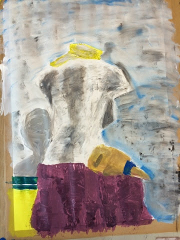
  We then had to move onto painting the setup with alternate methods, i did not enjoy this at all because i hate things to look messy and is not my style of painting or at at all, i found this technique very unstructured and i dont think i did very well at it at all! This was my final piece that came out of today. 

Monday, 19 January 2015

Animal sheet

For the second part of our Peter clark work, we were told to look at 3 animals that all related to our personality in some way, i chose to look at a stag as it reminds me of scotland and scotland reminds me of my grandad who passed away, it also is a symbol of fantasy and fairy tales which are the styles of art i like the most! I also chose to look at an owl as they look into things with detail, they are also very calm most of the time and dont seem to loose that calmness most of their life. The last animal i chose to look at was a chimp, i chose this animal as it is cheeky and playful although has a temper which if pushed the tiniest bit past their limit they will snap and that can be alot like me at times. I chose to use watercolour for the base colours then work back into them with pencil colours as i thought it gave the animals a look of hair/ fur or feathers. 

Impasto technique

The impasto technique is where you use paint and layer it up so you have thick paint on your page which leaves visible brush or palette knife marks. I was given a picture by nanda palmieri who painted swiss rolls in the impasto style. We first started with the base colours them moved onto working into the image with colours that are more like the ones used in the picture using quick and free moving brush strokes as to not make the painting look 'tidy' 

Tuesday, 6 January 2015

Peter clark

Peter clark works in the style of collage, he came to choose collage by collecting picture messages and comic books as a child. It gradually edged its way into his illustration work until it eventually took over. He finds his materials everywere, were ever he happens to be he always keeps a look out and hours and hours of looking through car boot sales and other stalls, also other people kindly give him pieces to use. He looks for old pieces with character they all have their own character within the picture and he looks into what the piece of newspaper or comic book actually means to him. His influences change all the time, some of these include worhol, japanese and chinese brushwork and coligraphy and soviet hiroic art. I like his work as he doesnt just throw pieces together he looks into what media he actually uses he doesnt just find a newspaper and use it he makes sure he is careful in choosing what colours he uses and what pieces of paper he actually likes. I like his use of colour as it makes his pieces look unusual and unique.